 Image source: Unsplash
Your logo is often the first thing customers will associate with your brand. It’s part of your brand identity and as such, it tells consumers who you are, what you do and how you do it, so it’s important to make sure that your logo ties in with your brand messaging.
Logos are the bedrock of any business, and they’ll be included everywhere from internal company documents and slides to social media and product packaging. Additionally, 93% of purchasing judgments are made on visual perceptions, which is why ensuring this visual representation of your brand really stands out and makes an impact.
The heavy burden of representation is placed on one little graphic. But don’t worry, if you’re designing a company logo for the first time and aren’t sure where to start, we have 5 tips that’ll help you make a really great logo.
1. Make sure your logo ties in with your brand vibe
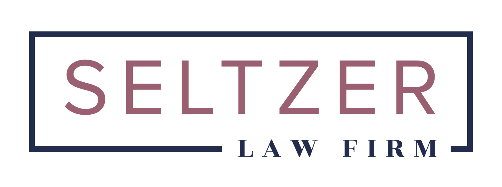
Your brand vibe is how you want people to feel when thinking or looking at your brand. Is your brand a hip new alcoholic beverage with a fruity island taste? Or is it a law firm located in a high-rise in the business district?
Thinking about what your brand is, what it offers and how it offers it will dictate your brand vibe. For the fruity alcoholic beverage mentioned above, your logo might have a playful, tropical feel, with a curly font and maybe a palm tree. Think of the brand Malibu, for instance:

Image source: 1000logos
While the big-shot law firm will probably use a traditional font like Times New Roman or Century Gothic in colours such as black, grey, or navy blue, there will be a lot of sharp lines and an absence of graphics, giving it a trustworthy and respectable feel.
Sometimes a brand vibe is referred to as a brand identity. Either way, your brand logo should be able to represent your brand’s personality so well that it’s picked up just by looking at it.
If you’re stuck, to help discover your brand identity , write down five words that encompass what you want people to feel when thinking of your brand. You’ll find that it’s actually pretty easy once you get going.
2. Use icons in your logo (if appropriate)
A logo is a visual representation of a brand. Which is why including an icon can help spell out exactly what you do, if the brand name doesn’t already.
So, incorporating a graphic of a cat and dog in a vet practice logo or perhaps including animal ears in the typography of the logo spells out to customers exactly what industry or field the company is in, without even having to read the brand name. A great example would be this Simple Cat font:

Image source:Simple Cat
Human beings are highly visual, so graphics and images go a long way in representing a brand.
However, as mentioned above, graphics are not always appropriate and it really depends on the brand and the brand feel to discern whether or not to include images in a logo. If you’re designing a logo for the law firm mentioned above, a minimalist logo with classic typography and devoid of images is sometimes best.
3. Use white space
Logos should attract people’s attention. A busy logo with too much going on could have the opposite effect.
Remember, less is more and this goes for logos too. Don’t stuff the design area with images and text so that it’s hard to discern one thing from the next. Centre everything and utilise the white space, or empty space, around your logo to your advantage so that you create a clean design. You want to make sure people can still see and read your logo at a distance or when it’s really small.
Using lots of white space in your logo can also invoke feelings in itself such as brand trust, openness and transparency, for example. Using a lot of white space also makes it easier to incorporate your brand into multiple different brand collateral as it will integrate seamlessly with different formats.
4. Use shapes
Shapes are a great way of incorporating imagery into a logo without the business of a graphic. Or, you could use shapes to create a graphic or icon! Some of the most famous logos are made up of simple shapes, like Microsoft, or National Geographic!

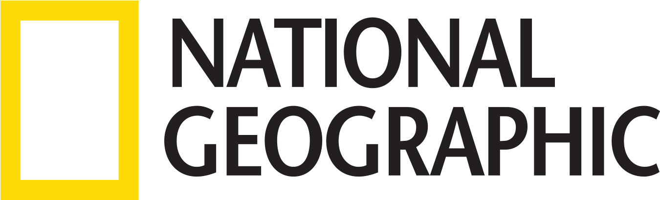
Image source: pngkey
Additionally, different shapes represent different things. An oblong shape like a square or rectangle often gives the feeling of more structure and could represent something being ‘boxed in’ or formal. While a circle could represent unity or timelessness, such as the one below, for example:
Shapes could also be used to contain a graphic or the whole logo. Using shapes to contain your logo has the added benefit of making the logo easier to transpose to different forms of brand collateral.
When designing the shape of a logo, it’s helpful to think of its intended purpose. Where will your logo be seen the most? If your brand makes eco-friendly cutlery, for example, a circle design might not be the best option as it could look awkward printed on the handle of a knife or fork.
5. Colour is key
Just as graphics, icons, typography and shapes play an essential role in communicating your brand identity, so does colour.
Different colours evoke different moods and feelings, and incorporating particular colours will help represent your brand personality.
For instance, dark blue represents professionalism, security and formality, which is why you often see a lot of corporations, as well as IT companies, banks and pharmaceutical companies using this colour in their logos - think IBM, Pfizer and American Express.

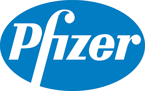

Image source: pngkey
On the other hand, orange stands for playfulness, vitality and friendliness. This is why brands like children’s tv network Nickelodeon, sports bar Hooters and orange soda brand Fanta incorporate this colour in their logos.
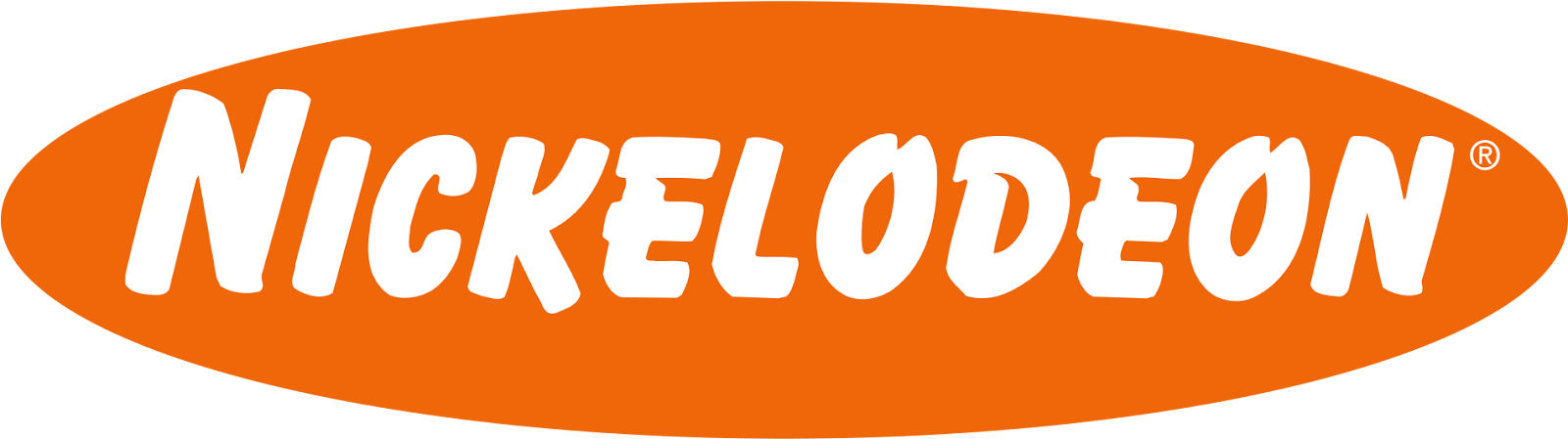
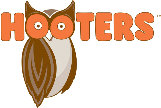

Image source: pngkey
Key Takeaways
A logo is the face of any brand, which is why choosing the right typography, graphics, shapes and colour, as well as utilising white space to represent brand identity is paramount.
Choosing correctly could mean the difference between potential customers opting for a competitor over your brand because your brand identity just wasn’t clear enough. Your logo should instantly tell potential customers who you are, what you do and how you do it so that they can make a flash decision about whether you are the right brand for them.
If you need help designing your brand logo so that it perfectly encapsulates your brand identity,
get in touch with us and our highly experienced design team would be happy to help.