The importance fonts play in your overall branding and brand experience is undeniable. Remember the early 2000s where everything from a school bake sale announcement to a neighbourhood-watch programme leaflet was written in the notorious comic sans?
Since then, people seem to have learnt their lesson when it comes to the value of fonts and the importance of utilising the right ones for a specific project. Using the wrong font can be the difference between a professional-looking piece of marketing material and a slap-dash, shoddy looking job.
In this article, we discuss whether you should consider using the same fonts throughout your omnichannel campaign, and which creative fonts we love and why.
Do you need fonts that span the omnichannel brand experience?
The importance of having a cohesive brand experience for your marketing campaigns cannot be stressed enough. How can potential customers be expected to understand the overall brand messaging and see each element of the campaign as a piece of a larger story if integral details like the fonts used aren’t coherent or compatible?
This is why the use of font families is a crucial aspect of making sure this coherence between different channels in the campaign is maintained.\
The difference between serif and sans serif fonts?
Serif and sans serif fonts are very distinct groups of typography. The difference lies in the presence or absence of ‘feet’. In other words, serif fonts have projections at the ends of a letter. Sans serif - ‘sans’ meaning ‘without’ in French - just means that the letters in these fonts are without these ‘feet’. It’s as simple as that.
Although the only physical difference between these types of fonts is the presence or absence of serifs, both types of fonts can have very different connotations attached to them. Serif fonts are usually used for projects that want to convey a distinguished, professional and discerning feel, while sans serif fonts generally give off a more playful, less serious and perhaps more creative atmosphere. With that in mind, let’s get down to our choice of the best creative fonts.
10 Creative fonts that will inspire you
When designing your next creative marketing project, we hope you gain inspiration from the following 10 creative fonts. The plethora of fonts available today provide endless ways for brands to convey a certain message to their audience.
1. Beyno
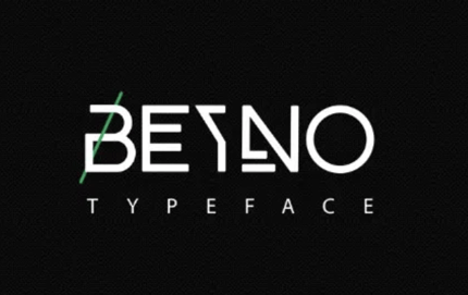
Beyno is a very simplistic font with a minimalist feel. It’s an uppercase font that provides just the right amount of playfulness, coupled with a dash of Art Deco pizzazz. Benyo would create eye-catching headlines and posters. It’s a very distinctive font that won’t be easily forgotten, here’s what it looks like:
 Image source: befonts
2. Moonshine
Moonshine is a cursive font, which means it’s a serif font. There is a shading effect in the lettering, which creates a rustic feel. We think this font would look great as the logo of a craft-beer brand 🍻. What do you think?
Image source: fontspace
3. Palmsprings
Palmsprings, also created by Billy Argel, is an uppercase font with a laid-back feel. The thick font is adorned with palm fronds to create a tropical feel. This font would be perfect for a casual beach-side eatery or perhaps a surf brand?
Image source: fontspace
4. Beautiful Bloom
Beautiful Bloom is what’s known as a brush font. The font has a somewhat feminine feel to it and was handmade by designer Mats-Peter Forss. It’s designed for wedding invitations, Instagram posts and so much more.
Image source: behance
5. Mon Cheri
Mon Cheri is a great whimsical font if you’re looking for something for your next star-struck project. It’s a very elegant sans serif font that uses stars in place of an “i” and “j”’s usual title in its lowercase version. It’s also very legible, so if you’re looking for something that will add a bit of sparkle while still being easy to read, try Mon Cheri 🌟.
Image source: creative market
6. Groovy
Groovy is a fun retro font for a ’70s themed party or campaign. Think “That 70’s Show”, the popular sitcom that got audiences loving bell bottoms and corduroy jackets again!
Incorporate this font to increase the groove factor. It was inspired by retro typography designs and comes with an additional extrude effect, which is like a shadow effect. It looks a little something like this:
Image source: creative market
7. Mollie Glaston
Mollie Glaston is a unique ligature-style font. It’s another example of a very feminine typography, and would work well for fashion headlines, clothing branding and t-shirts, amongst others.
Image Source: Da Font Free
8. Argö
Argö is a bold font with a sophisticated feel. This is a self-described serif font with a twist. Designer Anthony James added some medieval-style ascenders to the straight text. This font would work well for luxury food or fashion brands. We’re big fans of the versatility this font allows for.
Image source: behance
9. Sugar Free
Sugar Free is a fun, playful uppercase font. It resembles balloon art or bubbles and would look great on kids birthday party invitations or maybe theme park signage. The italic version also gives the font a completely different look and feel! How cute is the below application:
Image source: fontspring
10. Teorema Sans
Teorema Sans offers well-balanced reading and combines a range of different geographic shapes. The font family has 24 different fonts, some of which are free. It’s a very versatile typography that would work well for a wide range of projects.
Image source: befonts
Key Takeaways
Fonts can play an instrumental part in your brand tone of voice and help to portray the overarching message of a campaign. Whether you choose serif or sans serif, uppercase or lowercase, brush or Art Deco, choosing the right font for your project comes down to what story you want to tell and what you want your brand to represent.
If you need help with choosing a font for a marketing campaign or personal project, get in touch with us and someone from our design and layout team will be happy to assist.

